Branding & Styling
Match your Privacy Center's appearance to your brand — configure colors, fonts, logo, and field style using the Styling tab.
The Styling tab lets you customize the visual appearance of your Privacy Center without writing any code. Changes are reflected in the live preview panel on the right as you make them. Each section has a Reset button to restore it to its default values.
Styling is configured per brand — changes here only affect the current brand's Privacy Center.
Background
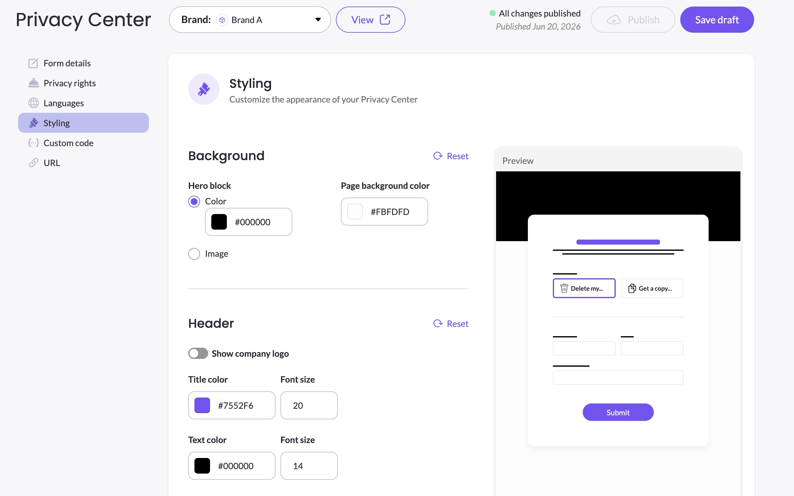
Controls the page background and the hero block at the top of the form.
Hero block — the banner area at the top of the form. Choose between:
- Color — a solid color set via a hex color picker
- Image — a URL pointing to an image to use as the hero background
Page background color — the color of the page behind the form card, set via a hex color picker.
Header
Controls the appearance of the form's header area, including the logo and text styling.
Show company logo — toggle on to display your company logo in the header. The logo is pulled from your brand settings in DSR Setup.
Title — the color and font size (in px) of the form title, as set in the Header element of Form details.
Text — the color and font size (in px) of the form description text, as set in the Header element of Form details.
Form fields
Controls the visual style of all input fields on the form.
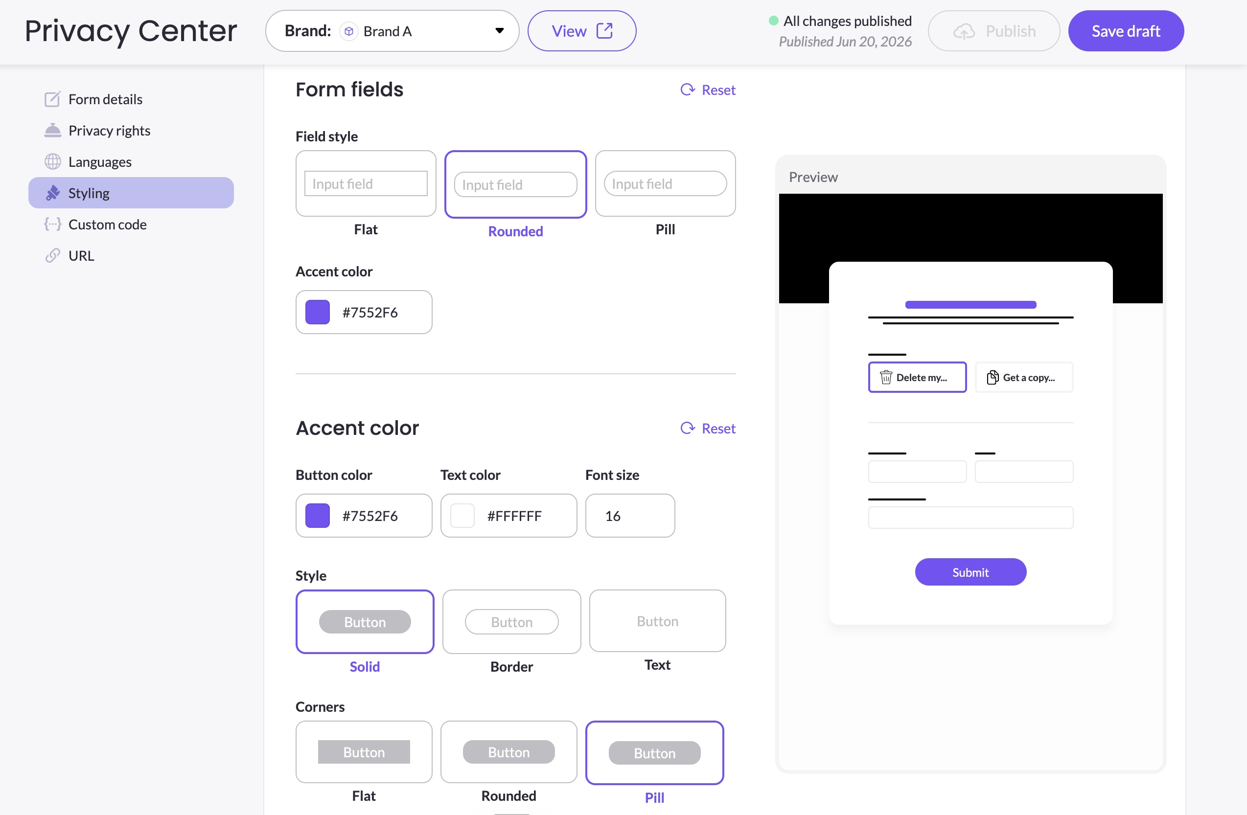
Field style — choose between three input field shapes:
- Flat — square corners
- Rounded — slightly rounded corners
- Pill — fully rounded corners
Accent color — the highlight color used for selected fields, focus states, and interactive elements within the form.
Accent color
Controls the appearance of the Submit button and other action elements.
Button color — the background color of the Submit button.
Text color — the color of the text on the Submit button.
Font size — the font size (in px) of the button text.
Style — choose between three button styles:
- Solid — filled button with the button color as background
- Border — outlined button with a transparent background
- Text — no border or background, text only
Corners — choose between three corner styles for the button:
- Flat — square corners
- Rounded — slightly rounded corners
- Pill — fully rounded corners
Saving and publishing
Click Save draft after making styling changes. Styling changes go live only after you click Publish.
For advanced styling beyond what the Styling tab offers — such as targeting specific elements, overriding layout, or applying custom fonts — use CSS via the Custom code tab. See CSS Customization Reference for available selectors, and Custom Code for how to inject CSS.
Updated 3 months ago