
Element Types and Their Properties
A reference guide to every built-in and custom element in the Privacy Center form — what each one does, its configurable properties, and which actions are available on it.
The form is made up of elements — the questions and content blocks data subjects see. There are two categories:
built-in elements: Predefined by Mine, have specific usage, and can be added once in the form
custom elements: General elements, which can be added multiple time to the form. Each custom element has configurable properties and a set of available actions.
To expand an element and edit its properties, click anywhere on its row. To collapse it, click the chevron.
Actions reference
Each element has a substance of actions that can be performed:
| Action | What it does |
|---|---|
| Translate | Opens the translation panel for this element across all enabled languages |
| Add logic | Adds conditional display rules (see Setting Up Conditional Logic) |
| Edit logic | Modifies existing conditions on this element |
| Delete | Removes the element from the form permanently |
Elements that show Add logic greyed out either cannot have conditions applied to them, or already have conditions applied by other elements that depend on them.
Built-in elements
Built-in elements are always present or available to add. Some are required and cannot be removed.
Header
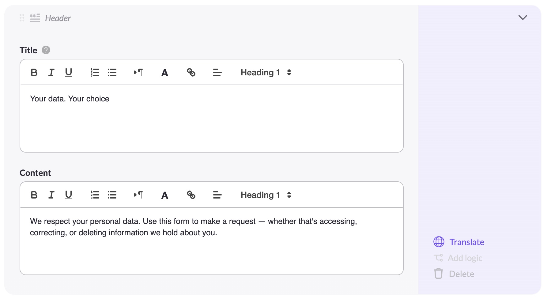
The title and introductory text shown at the top of the form.
Properties: Title (rich text), Content (rich text)
Actions: Translate. Cannot be deleted or have logic added.
Country
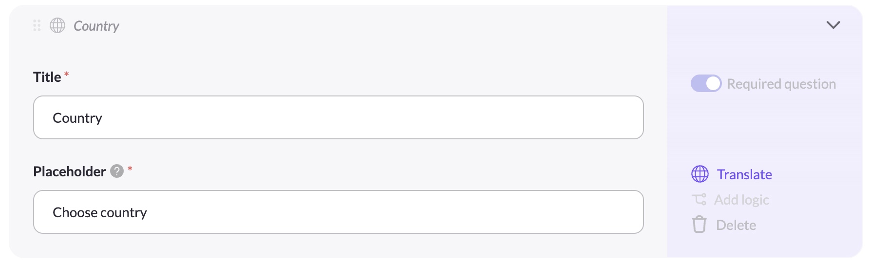
A dropdown where the data subject selects their country of residence. Always required.
Properties: Title, Placeholder
Actions: Translate. Cannot be deleted and cannot have logic added (other elements depend on it for display logic).
State
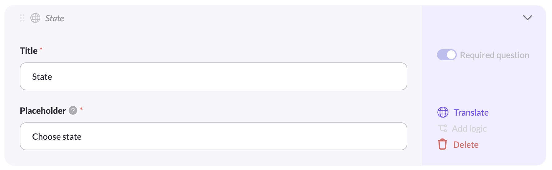
A dropdown where the data subject selects their state, province, or region. The State element works in conjunction with Right eligibility — if any privacy right in your setup has a state-level eligible region configured, the State element must be present in your form for that eligibility to be enforced correctly.
Supported countries: State options are available when the data subject selects one of the following countries: Australia, Brazil, Canada, Ethiopia, Germany, India, Micronesia, Myanmar, Nigeria, Palau, South Sudan, or United States.
Properties: Title, Placeholder, Required question toggle
Actions: Translate, Delete.
Cannot have logic added (state visibility is governed by Right eligibility, not by form-level conditions).
State and Right eligibilityThe State element is not added to the form automatically when you configure state-level eligibility on a right. You must add it manually. If a data subject's country has no state options (see supported countries above), the State dropdown is hidden automatically on the end-user form.
If you remove the State element while a right has state-level eligibility configured, eligibility for that right will not be enforced correctly for affected data subjects.
Privacy right
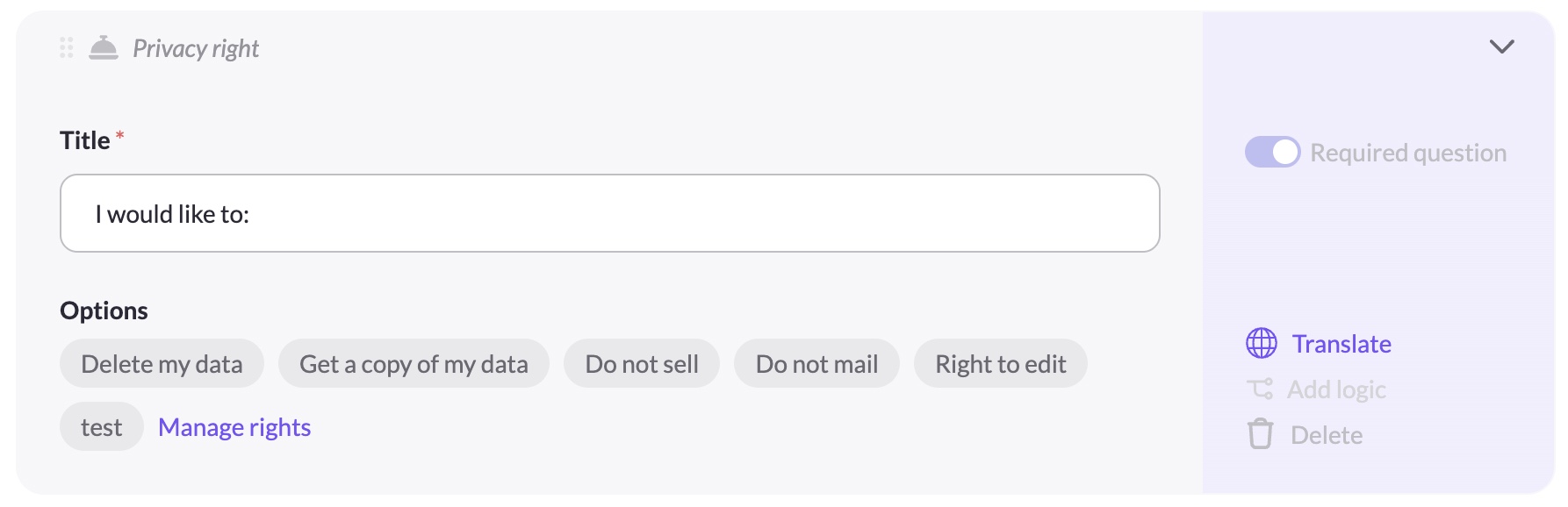
The rights selector — displays the privacy rights you've enabled in the Privacy rights tab as selectable cards.
Properties: Title, Options (read-only chips showing enabled rights), Manage rights link
Actions: Translate. Cannot be deleted. Options are managed in the Privacy rights tab, not here.
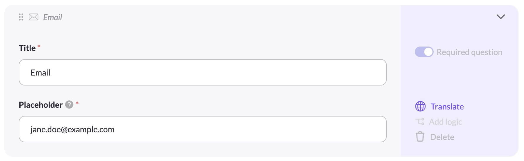
Email
The data subject's email address. Always required — used for the verification email.
Properties: Title, Placeholder
Actions: Translate. Cannot be deleted. Cannot have logic added.
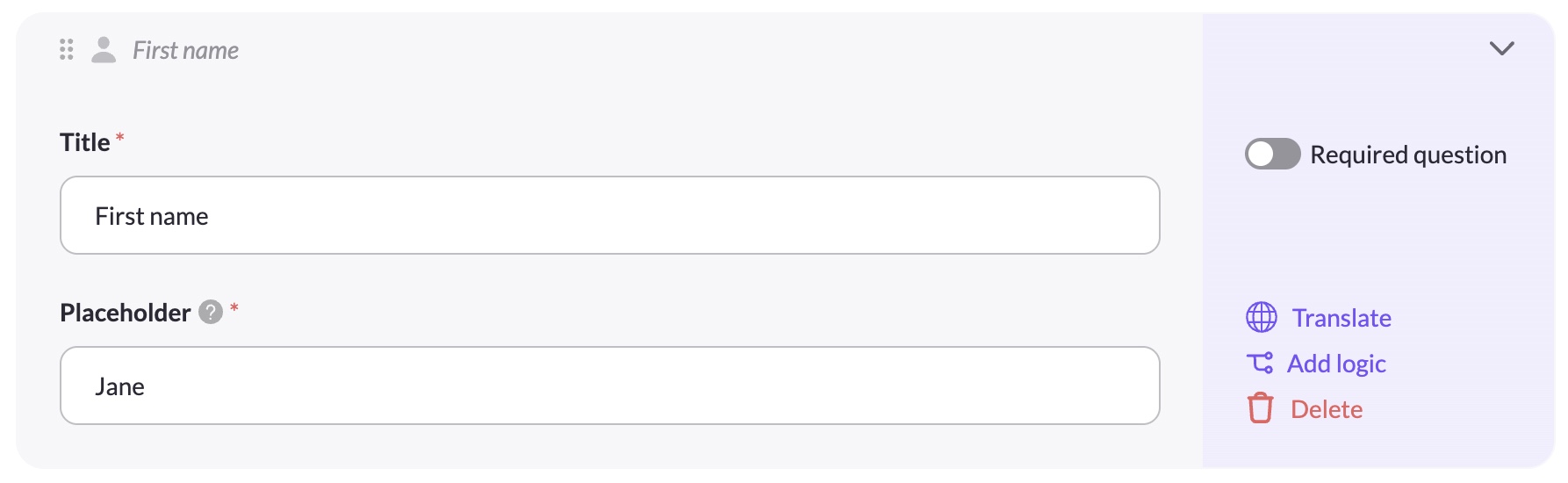
First name
Properties: Title, Placeholder, Required question toggle
Actions: Translate, Add logic, Delete
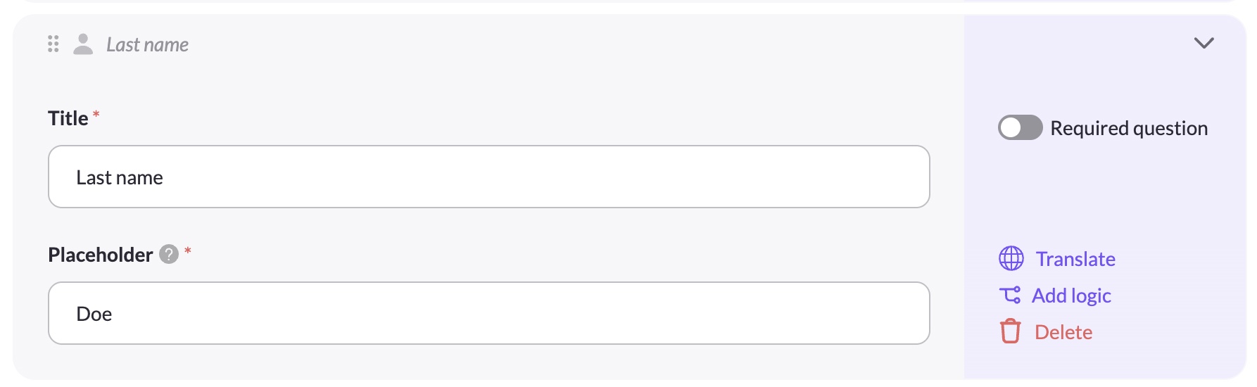
Last name
Properties: Title, Placeholder, Required question toggle
Actions: Translate, Add logic, Delete
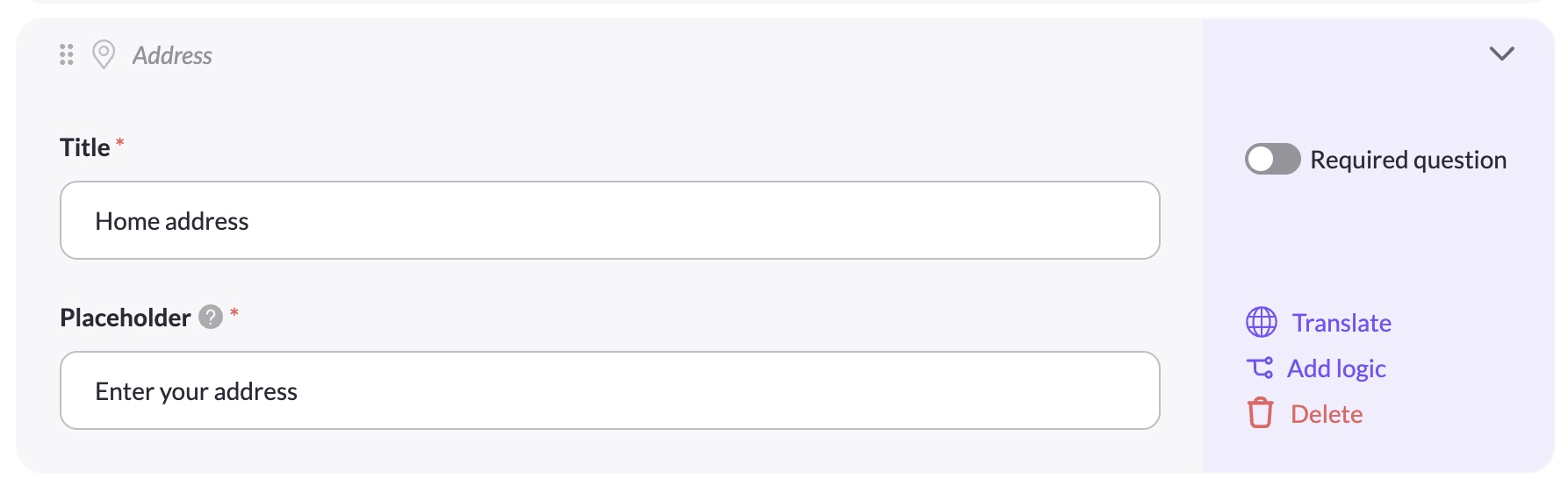
Address
Properties: Title, Placeholder, Required question toggle
Actions: Translate, Add logic, Delete
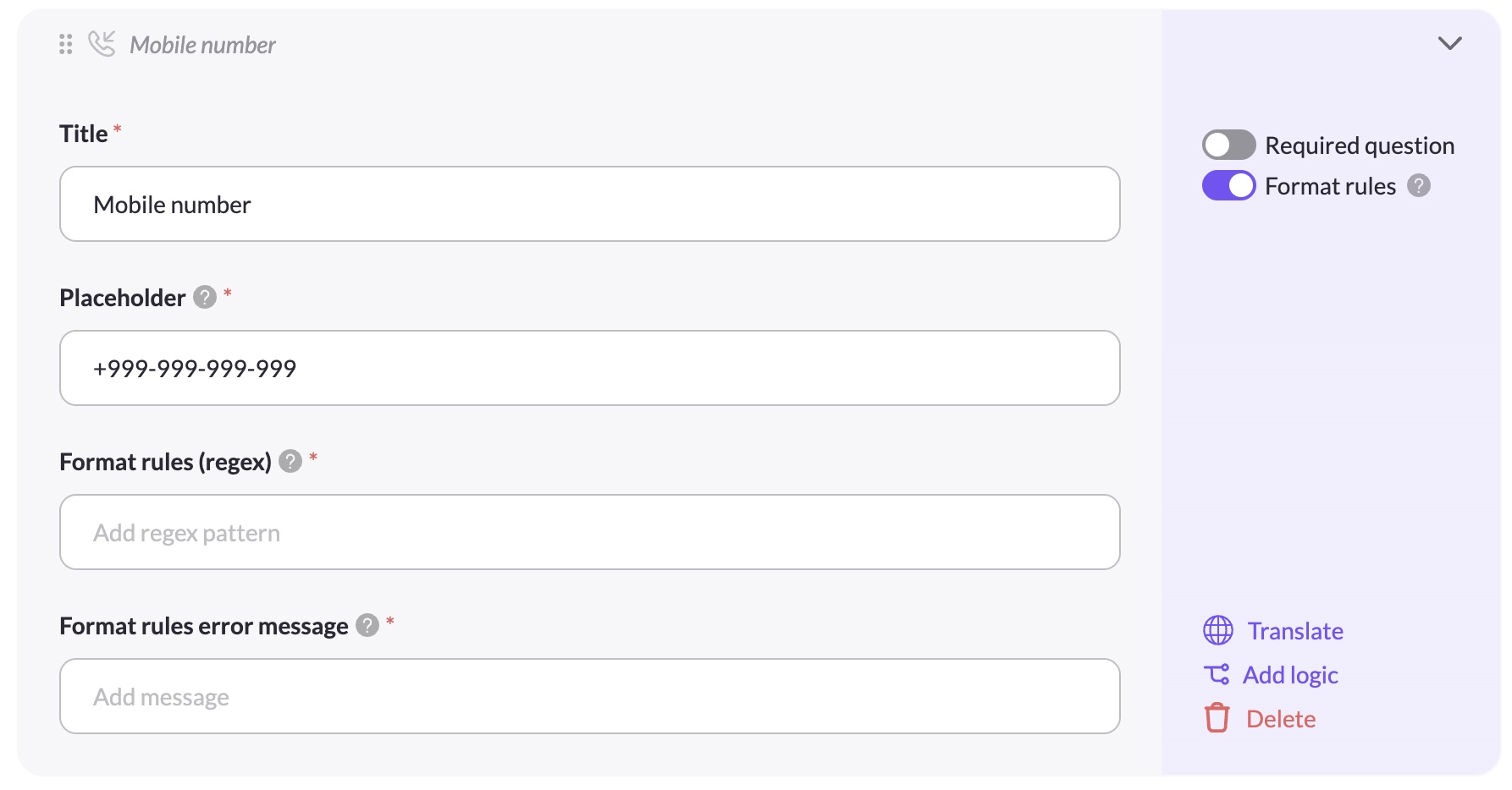
Mobile number
Properties: Title, Placeholder, Required question toggle, Format rules toggle (regex)
Actions: Translate, Add logic, Delete
Format rules lets you enforce a specific input format using a regex pattern. When enabled, you must provide the regex pattern and an error message shown when the input doesn't match. See Format Rules (Regex) for details.
Data subject
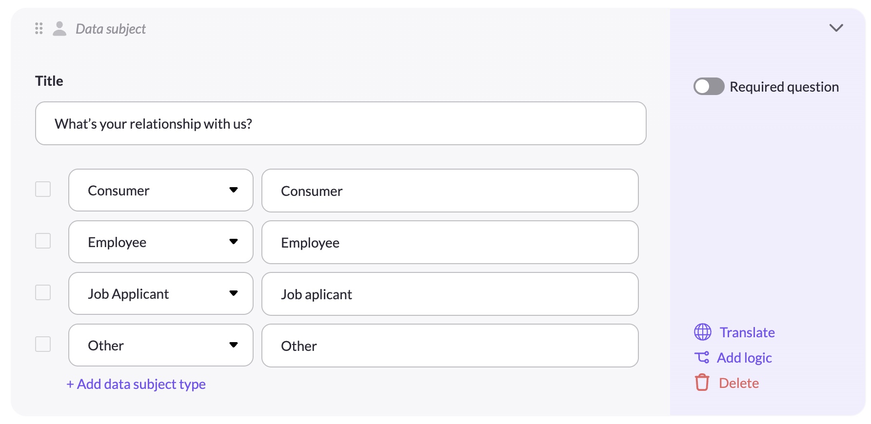
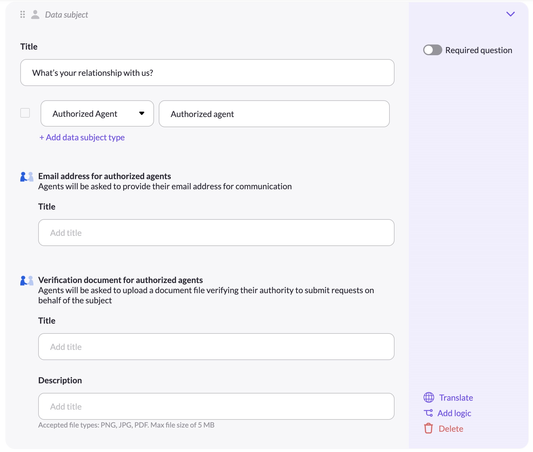
Lets data subjects identify their relationship with your organization (e.g. Consumer, Employee, Authorized Agent). Enabling Authorized Agent options activates the authorized agent sub-fields.
Properties: Title, Data subject type rows (type + label), Email address for authorized agents (title), Verification document for authorized agents (title + description)
Actions: Translate, Add logic, Delete
See Authorized Agent Support for a full walkthrough of this element.
File
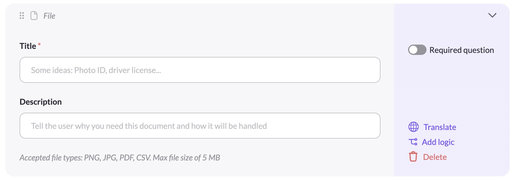
Allows the data subject to upload a file (e.g. Photo ID, proof of address).
Properties: Title, Description, Required question toggle
Actions: Translate, Add logic, Delete
Accepted file types: PNG, JPG, PDF, CSV. Max file size: 5 MB.
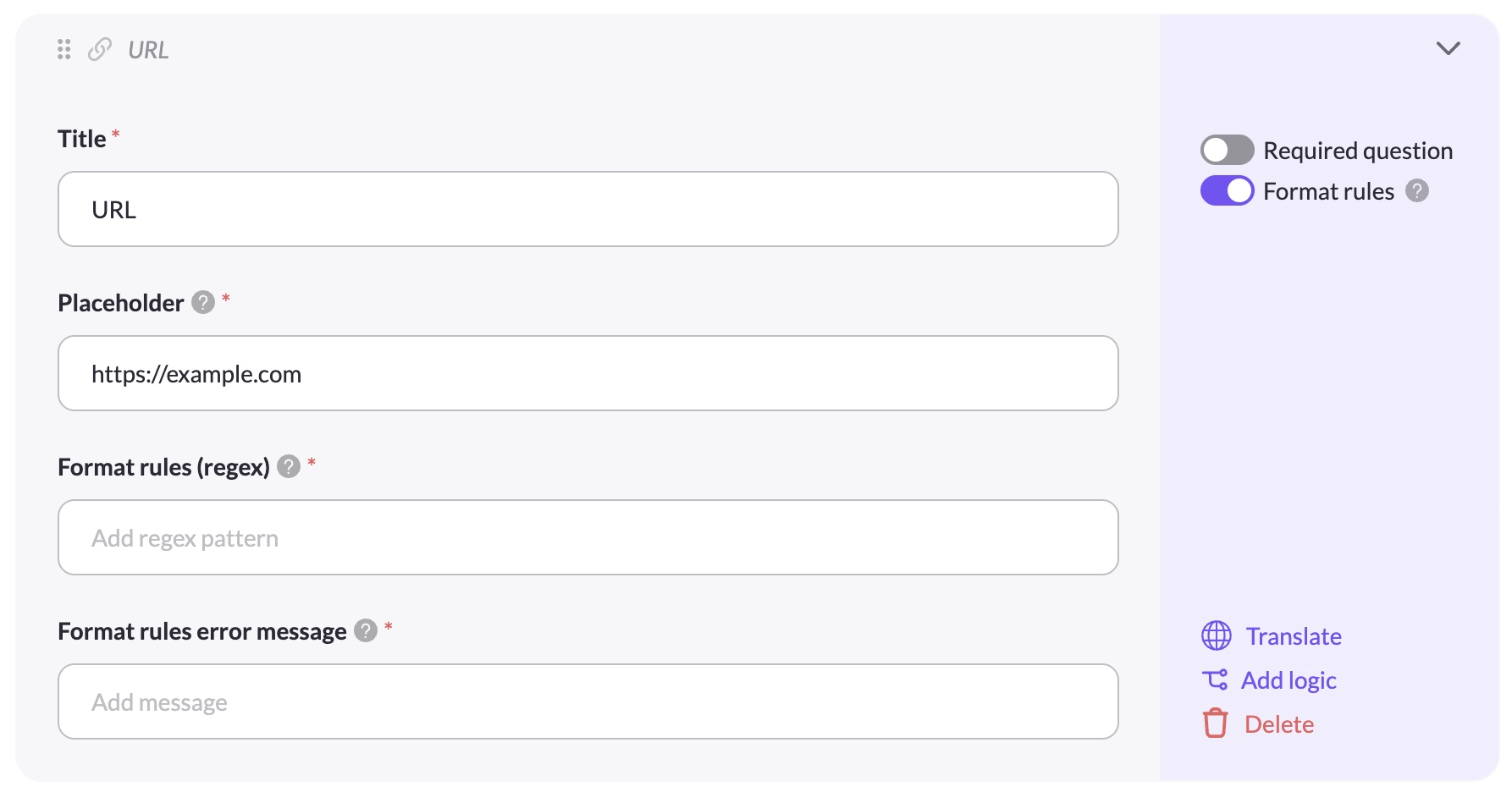
URL
A text input validated as a URL.
Properties: Title, Placeholder, Required question toggle, Format rules toggle (regex)
Actions: Translate, Add logic, Delete
Format rules lets you enforce a specific input format using a regex pattern. When enabled, you must provide the regex pattern and an error message shown when the input doesn't match. See Format Rules (Regex) for details.
Custom elements
Custom elements are added via the + Add question button at the bottom of the form. You can add as many as needed.
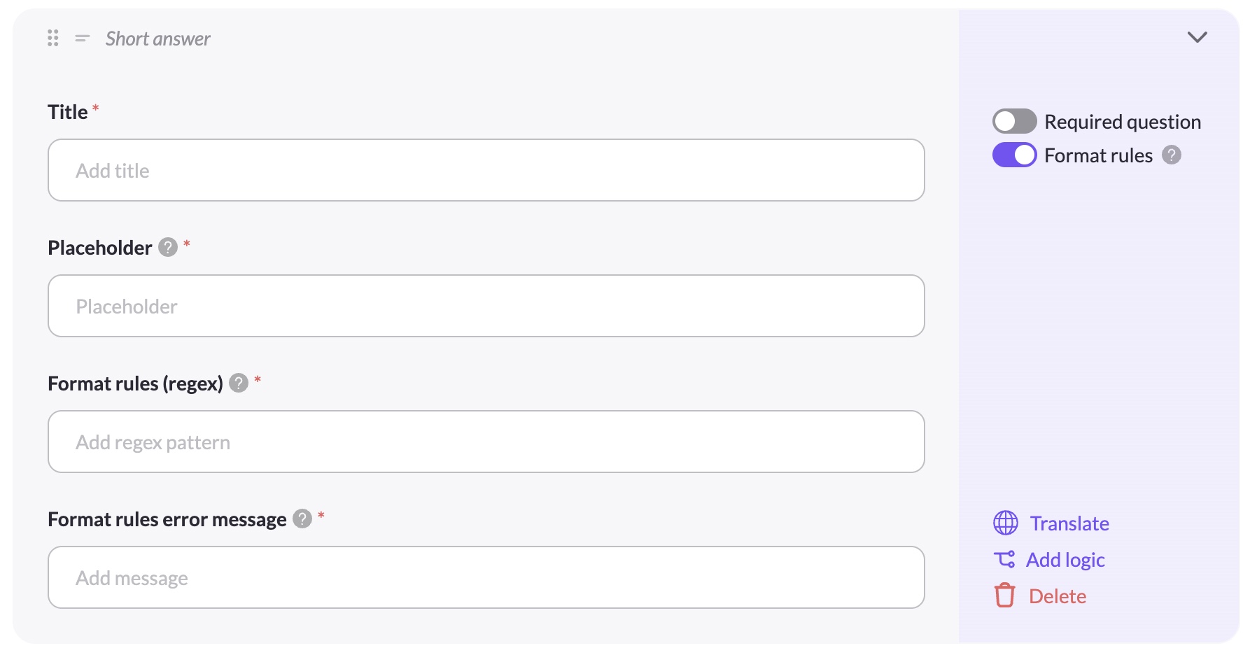
Short answer
A free-text input field.
Properties: Title, Placeholder, Required question toggle, Format rules toggle (regex)
Actions: Translate, Add logic, Delete
Format rules lets you enforce a specific input format using a regex pattern. When enabled, you must provide the regex pattern and an error message shown when the input doesn't match. See Format Rules (Regex) for details.
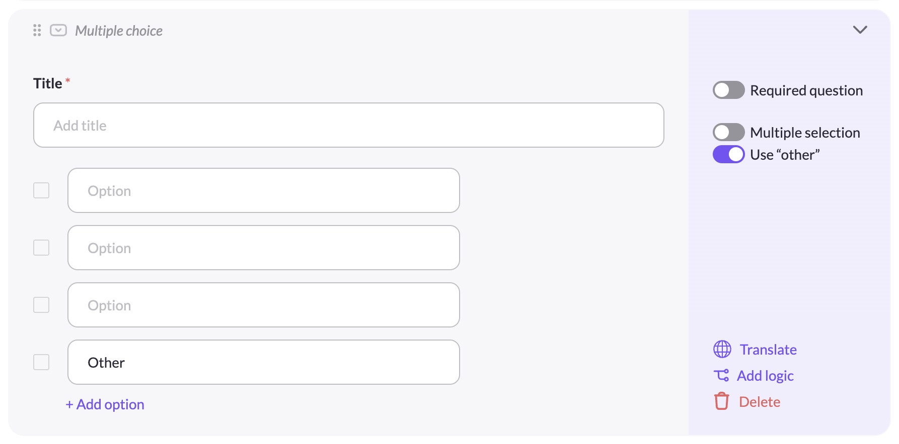
Multiple choice
A single or multi-select question with custom answer options.
Properties: Title, Answer options (add/remove/edit), Required question toggle, Multiple selection toggle, Use "other" toggle
Actions: Translate, Add logic, Delete
Multiple selection allows data subjects to pick more than one answer. Use "other" adds an "Other" option at the end of the list — when selected, a free-text "Specify your answer" field appears for the data subject to provide additional detail.
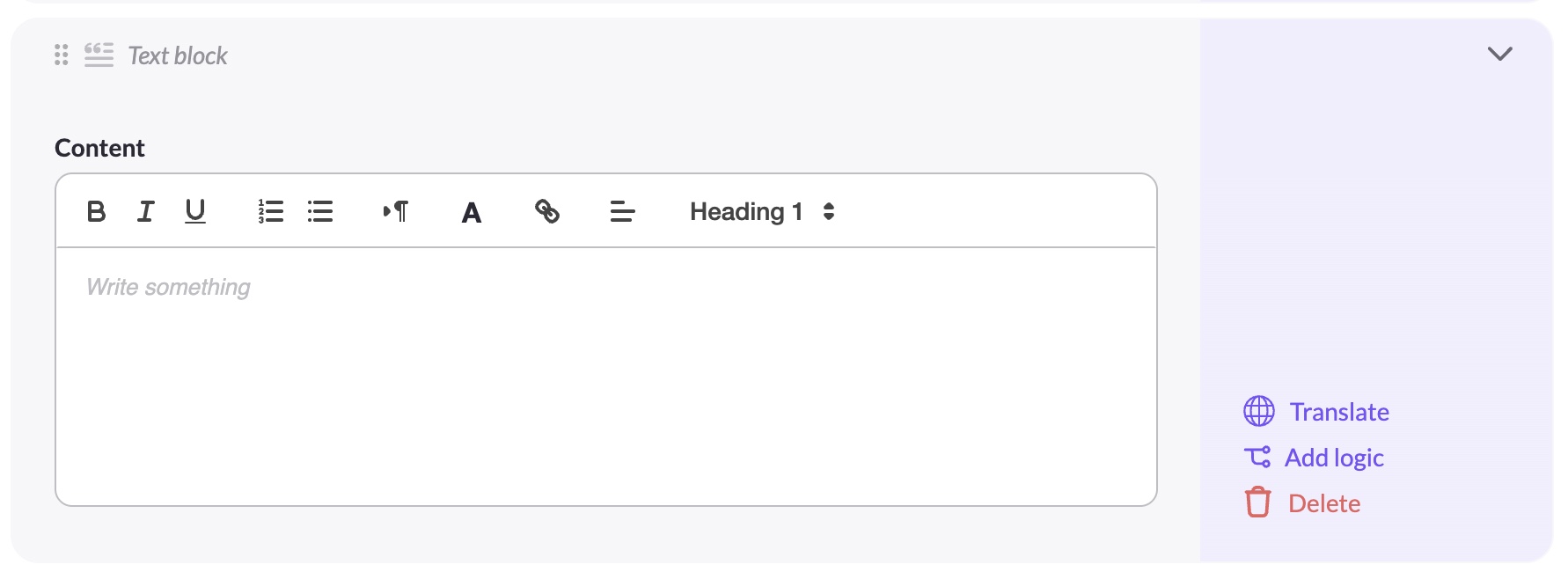
Text block
A read-only content block — no input from the data subject. Use it to add instructions, disclosures, or additional context anywhere in the form.
Properties: Content (rich text)
Actions: Translate, Add logic, Delete
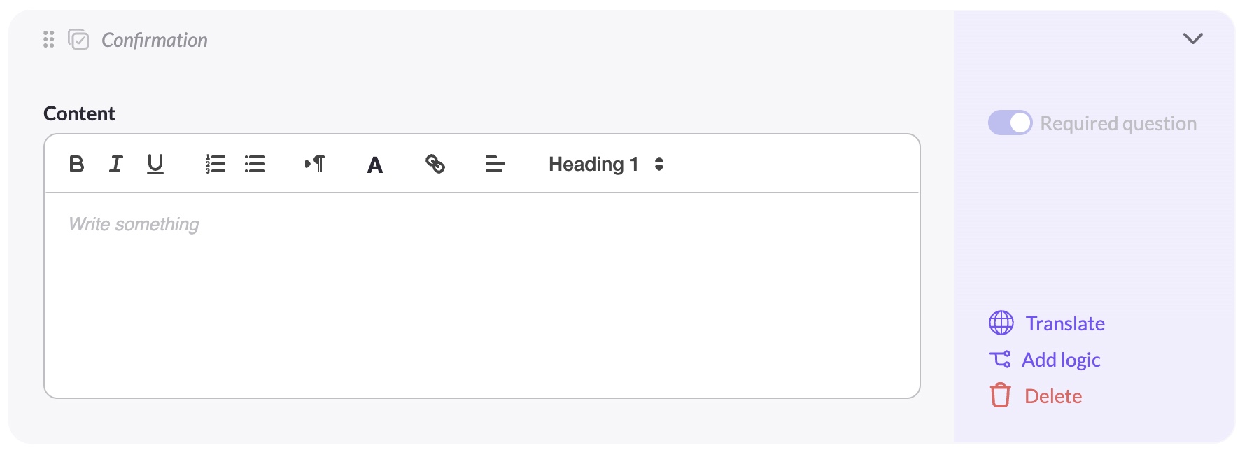
Confirmation
A checkbox that the data subject must acknowledge. Typically used for consent or accuracy confirmations.
Properties: Content (rich text), Required question toggle mandatory
Actions: Translate, Edit logic, Delete
Updated 3 months ago